Maximize Your Sign Investment
Make the most of your political yard sign investment by putting some thought in how your signs will display as people drive by. Research some different styles of signs and notice how a lot of the political designs are very outdated. With modern digital printing you have a lot more freedom with designs and colors . Maybe reach out to your kids or grandkids for a youthful perspective of some fresh fun ideas for designing your election signs. Or check out our Free Design Help! Just fill out the form with some basic info & our designer will create a custom sign just for you! If you like designing your own signs, below are some tips to keep in mind.
Common Mistakes
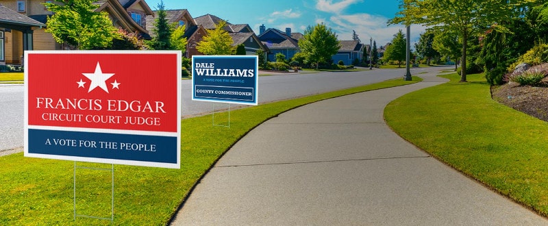
One of the most common errors people make on campaign signs is trying to fit too much info on their sign. Because of the size of the sign it is critical that you select 1 piece of information you want to stand out & be read. Make this word bold and fill the entire width of the sign. Generally this will be your name – either your last name or a nickname that your voters will recognize. Here are some ideas to help you visualize. If you like one of these election sign templates just click and edit the template to make them your own signs!
Example of image with too much text.
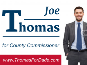

Using Photos to Stand Out
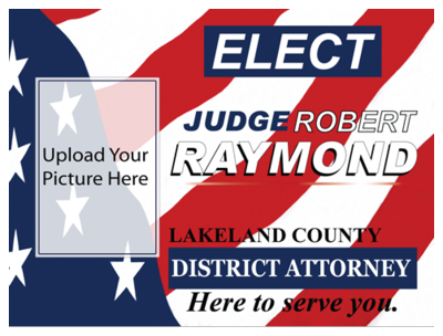
The next most important thing to ask yourself is how can I make my sign stand out from all the signs around it? I would recommend using a photo and use full color printing. Yes this takes some effort You will want to get a digital photo that is high enough resolution to enlarge & print on your sign. Also think of your sign design when deciding the position and angles for your photo. A photo shot from a smartphone is completely acceptable – just make sure you shoot with the highest resolution setting. Make sure the background is simple and does not compete with your photo. Or choose a green screen backdrop & edit the photo to the outline of your profile for an even more sophisticated sign.
Using Colors to Stand Out
Colors are also very important – you want a high contrast color – we recommend a white background with darker text such as red, blue, green and black. Full color photos are great too. Along with 3D, or dimensional text make sure to add some drop shadows borders and full color graphics. In today’s world signs are produced on digital flatbed printers. You are no longer limited to 1 to 2 colors. Take advantage of modern day cool looking graphics but always keep rule #1 in mind: Keep you name big and easy to read. Try not to get too fancy with graphics that compete with the clarity of your name. Here are some examples of signs that are too busy and hard to read from any type of distance.
Let’s Go Win Your Campaign!
If you keep these tips in mind when designing, it is pretty easy to design the perfect political yard signs that reflects what you are running for with a catchy and professional look. Design with our online editor or feel free to use a more robust design program such as adobe illustrator and then simply upload your design into our online designer. You will be able to see a real time proof of your sign along with pricing. Simple and easy to order in just minutes! Best of luck in your campaign efforts!
Transcript
Running any campaign means in a small way we all become marketers and entertainers, it’s our job to present our brand in a way our audiences will accept process and recollect when it matters. A large part of this process concerns the presentation designs and the decisions we make prior to purchasing. Such as the fonts image sizes clarity and the expected distance and speed the audience will see your signage. We can imagine there being a peak point for every sign the point in which your audience is neither too far away or too close will call this the target distance. And all of your design decisions revolve around this point or range depending on a number of factors. We’re going to dive into these, factors can change from case to case depending on who your target audience is. Such as the street pedestrian versus the passing car. Rule one as the distance and speed increases of your passing audience your signage should become larger and a message simpler. This will increase the awareness of your signage when your audience may only have moments to glance at your sign. Rule two take your message and boil it down to the smallest most easily comprehensible message possible. As one would imagine as we add more content to a sign the text or images must become smaller to accommodate more content. Following this path we risk losing our audience’s interest as they pass your signage this factor only amplifies as the speed in distance of the audience increases. Rule three take special care when choosing the colors for your campaign signs and consider the locations or signs will be placed at. You wouldn’t want the colors to seemingly fade into the background because they aren’t noticeable. We’ll cover the basics of color design in a different video. However, rule four taking out a look at your sign placement ideally your signage should be an area that is well-kept or above any foliage that may get in the way. Scope out in advance areas that will receive high traffic and taking a consideration
traffic patterns based on the time of day. Also, take into account wind or dust will affect your sign and consider upgrading to protection plus or adding wind slits for banners. When we enter the world of campaign promotion it’s often beneficial to take a step back and look at the signage from your audience’s perspective is the sign large enough, how far away is it, is the audience expected to be moving quickly or slowly, is the image clear is there too much content to be read or understood quickly? These are the questions every sign should be pressed on and the results will be in your audience’s response.